Tuesday, 23 November 2010

Design Extraction

Layering Materials

 Above and below done using Mulberry christmas gift guide


Below four pages done using pages from Spring Studios magazine

Layering Food

Layering Objects

Layering Images

Layering to Conceal


Above and below: Nick Knight, Flora, 
Natural History Museum, Nick Knight 1997


Below are two design extractions I did using my Nick Knight research for layering and research I did on Zoe Bradley who uses large scale paper folding to create her garments. In the image below the tracing paper pattern is a repetition of the outline of the silhouette of the leaves in the Nick Knight photograph. The illustration is based on leaves and Zoe Bradley's work.


Zoe Bradley

 Above and below: Viktor & Rolf, Back Light S/S 1999


Zoe Bradley

 After doing my design extractions I came across this Vogue feature by Nick Knight and I was surprised by how similar it was to what I had been doing. I love how massive branches have been used to create wing-like shapes and I think it gives the photographs a real edge and impact.

Below six images: Nick Knight, British Vogue February 2010


Malgosia Bela by Tim Walker for Vogue Italy September 2010

Whilst doing some research for another module I came across this dress by Zoe Bradley and thought it linked really well to what I had been doing in my design extraction with the leaves because the dress is just made from giant paper leaves.

Zoe Bradley

Above two images: Valentino S/S 2008


Nick Knight, Rose

Viktor & Rolf, Flowers S/S 2003


 Zoe Bradley


Zoe Bradley

Nick Knight, 'Fashion-Able', Dazed & Confused, September 1998


Friday, 5 November 2010

Pattern Cutting

This was a pattern cutting practical using patterns from Pattern Magic by Tomoko Nakamichi. Staying in our concept word groups (layering) we were given pattern templates from the book that reflected our concept word.

I worked on the one above using brown paper. As you can see the way that the pattern weaves together is a form of layering. I found working with the brown paper refreshing as it made a change from doing patterns in fabric. However, I did find it a challenge when it came to constructing the pattern on a mannequin as the paper wasn't as flexible as fabric would have been which made it harder to put the darts in. 

This is one made using calico done by other members of my group.


In comparison to the calico, I think the paper gives an interesting shape and structure due to the stiffness of the material.

Sunday, 24 October 2010

Research for Concept Word: Layering

After being given our concept word: layering, I decided to do some research using my own collection of books. I looked at:
  • Nick Knight published by Collins Design
  • Tim Walker Pictures published by teNeues
  • Vivienne Westwood by Claire Wilcox
  • Alexander McQueen Genius of a Generation by Kristin Knox

I really like the image below by Nick Knight because of his use of colour; keeping all the leaves within the colour palette of pale blue gives a glass/translucent look to the leaves adding to the delicacy and fragility of them
Cecropia schreberiana, Flora, 
Natural History Museum, Nick Knight 1997

Miranda Vincente, One in Ten,
Dazed & Confused, Nick Knight 2000

Lily Cole, Page from scrapbook 
'Lily Takes a Trip', Tim Walker 2005

I like how layering has been used in the photo below by Tim Walker because of how he has taken an everyday object (the mattress) and multiplied it to look ridiculous and unnecessary. I also like the child-like theory to it in the way that it's something a child wouldn't consider to be ridiculous or unnecessary
Guinevere Van Seenus, Glenham Hall, 
Suffolk, England, Tim Walker 2006

I really like the idea of using a layer to conceal something or make it more elusive and mysterious, like below; wrapping the house in a huge bow makes it seem more special and intriguing. Also the way the door is ajar makes it look inviting, you find yourself wondering about what's held inside
Andy Macgregor, Great Treverran, Cornwall, 
England, Tim Walker 2006


Above and below: Nostalgia of Mud, 
Vivienne Westwood A/W 1982 


Birds, Alexander McQueen S/S 2001

Friday, 22 October 2010

Fashion Illustration Research

After experimenting and practicing fashion illustration in the last session I decided to research some fashion illustrations that I liked from some of my fashion illustration books

I really like the illustration below because of how the watercolours subtly suggest the garments colours and how the use of pencil line shows how the top would look

Watercolours and pencil on paper, Molly Grad 2006 from 
Fashion Illustration by Fashion Designers by Laird Borrelli


Although this isn't so much a fashion illustration I decided to include it in my research because I like how her hair has objects in it; this could be used in my fashion illustrations and instead I could use objects that show the inspiration behind my idea, garment or concept

Ink, pencil and Adobe Photoshop, Am I Collective

Pen, ink and photography, Katharina Gschwendtner
I really like the image above because of how it combines photography with illustration; demonstrating the ideas(illustrations) and the actualisation(photograph) in one image


Above two images from Digital Fashion Illustration by Kevin Tallon


All images below from Illustration Now! 3 edited by Julius Wiedermann


Above and below: Pen, ink, Adobe Photoshop and 
Adobe Illustrator, David Despau 2008


Pen, pencil, ink, collage, Adobe Photoshop and Corel Painter, Sophie Griotto 2008


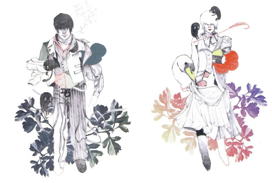
Him/Her, book illustration, 2006, D&G, 10th Anniversary Book
Graphite, coloured pencils, paper, lithography prints and Adobe Photoshop, Fumi Nakamura